In her review of Demon Night, the first thing Holly mentions is the cover, and how much she loves it.
Let me be honest: Those are some of the most wonderful words an author can hear. We all know what really matters is on the inside, but it’s the cover that often gets a new reader to pick up a book … or to leave it on the shelves. There are few covers that every reader will love, of course. Some of us love clinches, some of us hate them. Some of us love the man-chest covers, some of us don’t. Some of us go to sleep at the sight of a landscape, a ribbon, or jewel. Show a face, or cut off the head? Everyone has their preferences.
I’ll admit I’m a fan of a well-done clinch. Not the straining, woman-on-her-knees (see: Johanna Lindsey covers) clinches of yesteryear (although a part of me still loves those), but a nice, two-person cover, embracing optional. Part of that might be nostalgia, or my immediate association with “romance” when I see a couple. I also like heroine-only covers, probably because I’m a heroine-oriented reader, and I love a strong-looking woman on the front of a book.
I’m less a fan of the man-only covers, simply because the focus seems to shift from the relationship between two people, to selling the image of a man to me (the first one I really remember was the stepback to Christina Dodd’s A Well-Favored Gentleman, and although the guy was a hottie, my first reaction was: where’s the woman?) — and I’m never sure if I’m supposed to be offended when someone seems to think I’ll buy something just for the sexy. There are exceptions to my “I prefer a clinch to a solo guy,” though — and my cover is one.
No, no — not just because it’s my cover. It’s because this cover manages to hit all of my happy buttons, on both an aesthetic and marketing level.
First of all, there’s his pretty face: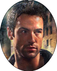 Yeah, yeah. I can be shallow — and this guy is hot. I don’t imagine myself in the heroine’s place or think about jumping him; I just think, “whoa, that’s a fine-looking man.” I’m not sure who the model is, but I know I haven’t seen him a thousand times yet, which is a huge plus for me. And I love his hair: no mullet. (That is, by the way, a request I make with every book; I beg my editor, “no mullet, please please please!”)
Now, here’s the big question: does he look like my image of the hero? … no, not really — but that’s okay. It would be impossible for Berkley to find someone who matched my vision of the hero exactly — and my vision isn’t going to match the reader’s vision, anyway. I know there are some readers who prefer not to have a face on the cover, but I don’t mind either way. Generally, the coloring is right (Drifter has brown hair and amber eyes) and he’s not an ogre, so I’m happy.
Next thing I love: he’s wearing clothes! This is a completely personal preference; I love a hot man on a cover, but I also like him dressed. A pair of jeans and t-shirt or an amazing suit is just as sexy as skin, IMO — especially if it’s worn well.
The nice thing about clothes, too, is that they are an immediate signal to the reader about the time period of the book. A pair of breeches and riding boots? Regency, most likely. A tartan? A pair of fuzzy underpants? (Okay, that’s probably He-Man, not a romance.) So this one, he’s wearing a leather jacket, which clues in the reader: urban, most likely, and contemporary.
Again, he’s not exactly wearing what my hero would (Drifter wears a brown fabric duster), but I understand the problem my publisher faces: if they put him in western clothing, would readers get the wrong impression about the subgenre? Would fans of western historicals be picking up the book instead of paranormal romance fans? So the duster is out, and a leather jacket the next best option.
Of course, it also brings up the question — why isn’t he wearing a shirt? Doesn’t the leather chafe?
It might, if he wasn’t a Guardian. But that brings me to my next point of cover love:
His chest is bare, but not all up-in-your-face. Because it’s not that I don’t appreciate a nice male form, or that I don’t do a bit of objectification now and then. I like a manly chest, and a great-looking dude with a rockin’ bod is going to make me look twice. Sex sells, no doubt about it.
But I like that, in this cover, I don’t feel as if I’m being sold entirely on sex. It’s there, but it’s in the corner, and covered with chest hair and the title font so that it doesn’t gleam and become a focal point. Because, yeah — my books are sexy. But I would hate to give any reader who picked them up the impression that ‘sexy’ is all they are; the other design elements help balance it out.
Nor is this about the “image” of romance, exactly. I’m the type of reader who can read a clinch-covered book anywhere (the only line I draw is the almost-naked erotic covers, but that’s just because I’ve got a little girl, and they slip just over my border of “what’s appropriate” for public … and anyway, most of those books I wouldn’t want to be reading in public, because, um, if I was sitting next to someone who started breathing heavily and squirming, I’d be weirded out, too.)
And covers are designed to do two things: sell the book, and give the reader an idea of its contents. So I’m of the opinion that no matter what image you slap on the front of a romance, it’s going to be derided in some way. For example, you’ll find the same naked chest on an exercise magazine as you might on a romance — but few people will judge you for reading a muscle magazine in public the same way they will a romance. It’s the content behind the image they’re judging, and extrapolating how they perceive that content onto the cover.
Even if you put flowers on the front, someone is going to look at it and say in a meaningful way, “Oh, a flower. I get it.” A less blatantly sexy image will only make the jerks dig a little harder to find their ammunition. So here’s what I think about the image of romance from a non-romance reader’s point of view: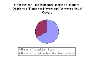
Not caring does take some effort, unfortunately, because it’s not coupled with ignorance of any kind. You still have to dismiss the looks, and fight not to roll your eyes. Sometimes that’s hard, especially when you’re reading a really, really great romance with characters you love, and who have much, much more going on in the story than a simple, “let’s meet, screw, and fall in love.”
So to me, the image of romance won’t change unless those outsiders read a couple of good romances.
Within the genre, and the readers who love romance but still don’t like the clinch or the typical covers, I understand that. We all have different levels of tolerance, different preferences for how we’d like our reading material packaged. The Spymaster’s Lady, for example: the cover doesn’t bother me at all. I recognize the cheesiness of it, but it doesn’t put me off in the least (although I’d prefer a clinch). Again, that might be my nostalgia (and really, my appreciation for all things cheesy.) But I’ve read in several places that readers might have passed up a wonderful read either because a) they actively disliked the cover, and b) there was no real indication, aside from the clothes the hero is wearing, of what was inside the book … that even putting the heroine on the cover would have been a better clue, because she’s such a strong character.
Both of which are a terrible shame (and I know it kills me to think of readers who might be turned off by my covers, and how many good books I might have missed because I passed over a landscape). But I also don’t know if either is easily resolvable, especially if — just through the power of the man-chest sales — that wonderful book ended up in more hands and in front of more readers than it might have been, given any other cover. I hope there exists a good compromise, if not for everyone, at least for most — and that publishers will land on it soon.
Speaking of compromises (awkward segue!) here’s another reason I love this cover: The spots of light serves as a great compromise for wings. My first book, Hot Spell, had a gorgeous cover — and in reader feedback, one element mentioned over and over was the cover, and the wings. So when my editor asked me to give input on the cover for Demon Angel, I brought that up — and Demon Angel‘s cover used the wings and a similar color scheme. Now, some readers loved the Demon Angel cover, some hated it, some loved the wings and some didn’t want to pick up the book because of them … but the biggest concern (and why we ended up changing the look of the series) was the confusion the wings and the lighter color scheme created. Some readers simply didn’t know what they were buying. Was it an inspirational? Was it light in tone? Was it all about heaven and angels?
So we knew we wanted a darker, grittier, more urban look — but at the same time, what was a good way to show that this was about Guardians — not demons or vampires?
I think the art department came up with a fantastic way to get the ‘angel-ness’ across without using wings: they put in spots of light, creating a kind of small, halo effect around the model. So even though the title says “demon,” you get the sense that the otherworldly being here isn’t one. For the next cover, I requested the same visual effect — we’ll see if it works out 🙂
Finally, there’s just something about the way it all comes together that I love. Some of it is the “movie poster” look to the cover; that’s exactly the feeling I want readers to get when they look at the book. This is a story that contains action, elements of the paranormal, is dark and gritty and sexy — and I think it conveys that well.
I also love that the model seems to be caught in the middle of a movement, instead of being “posed” (because in reality, I know this is a pose from a photo shoot.) I love that he’s not staring out at the reader with an “I’m so sexy” glower, but off to the side, as if there’s something happening just past the edge of the scene that we can’t see, suggesting action — and suggesting that there’s a lot more going on than just a hot guy (but also not discounting the hot guy). It’s so easy to think that he’s just spotted the heroine in danger … and in the next second, he’s going to save her.
And, in the end, all of my usual concerns about solo-male covers were completely obliterated in one nice package.
So I’m wondering: what types of covers do you prefer, and which do you usually avoid? And if you avoid a certain type of cover, are there any that you liked anyway, just because it was so wonderfully put together?





Does leather chafe?? LMAO!!
At least he is not waxed like no tomorrow. I do like some “fur” on my men’s chest 🙂
I like the more subtle covers perhaps a model a shadow or a certain body part coming off from the side.
Meljean, First off, I want to say that this post was absolutely hilarious! Love, love, love the excel graph. That totally cracks me up!
As far as covers go, if I want to read a book, there is nothing, absolutely nothing, that they could put on the cover that would make me turn away from a book.
On the other hand, if I don’t know anything about the book or author and I like the cover, it’s very possible that I will buy the book just because of the cover. Case in point, Release by Jo Leigh. Oh, this cover was smokin’ hot! I would never have bought this book if it wasn’t for the cover.
katiebabs — I like the subtle covers, too. Just the arch of a neck or the curve of a hip is very sexy, I think … and then for guys, I want the neck, every time.
Jill — lol! I love graphs; I might just make a post entirely with them, next time.
I agree about books by authors I’m familiar with. Like, if Gena Showalter came out with a book with nothing but a hairy butt on the cover, I’d still buy it.
And there are others that I will pick up just because of the cover. Recently, KISS OF FIRE by Deborah Cooke was one. After reading the description, I’d have been interested anyway — but that cover (and it’s a solo male cover!) would have made me stop and buy it, regardless of content.
When I’m browsing books, I try really, really hard to not let a book’s cover sway my purchasing power. But the truth is that a really fantastic book cover definitely grabs my attention.
I’m totally drawn to book covers that are monochromatic. I love those that feature the heroine only such as Diane Whiteside’s Bond of Fire, Sunny’s Lucinda Darkly (or any of her covers really) or Melissa Marr’s Wicked Lovely. I also love a well done passionate embrace, but still favor the single color scheme ones such as JR Ward’s Black Dagger Brotherhood covers, Keri Arthur’s Riley Jenson covers, or Lara Adrian’s Midnight Breed covers. Adrian’s covers also have a cityscape element to them, which I also really like.
Christine — I think those up-close on the neck-biting couple, monochromatic covers are probably where a lot of (especially paranormal romance) covers are heading. They aren’t embarrassing in any way, but still hot. I’m also a huge fan of Adrian’s city-scape.
Honestly? I don’t even look at the covers. I just check the back blurb. The covers don’t even register for me until after the fact.
Take this book for example. I really loved the cover, but the only reason I really noticed it is because I already knew I wanted to read it. If it had been something I’d never heard of before, I wouldn’t have even noticed.
I always laugh at the girls here when they make fun of some terrible clinch cover. I just don’t see it.
Great post, Meljean. You crack me up.
I also have to admit I do like a little skin on my covers. For some reason I like a bit of shoulder or a leg.
But these new covers with multiple people half naked with their bums hanging out makes me cringe a bit. I am always worried I will be reading on the bus to work and some little old lady will sit down next to me and look over. Well maybe she will want to borrow it. *G*
katiebabs — The bums hanging out do make me look twice, though — so perhaps that accomplishes their purpose?
But, definitely, I probably wouldn’t take one out in public. Again, not out of any embarrassment on my part, but it just doesn’t seem appropriate. I don’t like making other people uncomfortable (unintentionally), and nakedness does that.
Holly — hee. Thanks again for inviting me 😀
Holly – You are honestly never compelled to read the blurb on the back cover based on what you see on the front cover? Oh man… you make me feel so superficial! lol
Most of the time, I am heading to the bookstore with the intention to buy a specific book because I’ve stumbled across it on amazon, a blog, a review site, author site, or because of a friend’s recommendation and that decision has nothing to do with the book’s cover. But once I’m actually in the bookstore and start browsing, its the book covers that definitely get me to pick up a book and read the back cover.
I have to say, I don’t really like covers that are overtly sexual–not because I can’t enjoy the sight of a hot guy nearly naked, but because I’m embarrassed to have them in public. And when I’m reading a book, I take it with me everywhere–I whipped DN out today when I was waiting in the ridiculously long line at Subway.
Meljean–I wasn’t a huge fan of the DN cover, but now that you’ve explained all about it, I kind of get it. (I didn’t think about the light behind him suggesting his wings/otherworldliness–but that’s pretty cool.) And I wish that he looked more like the Drifter that’s in my head (where are his suspenders?? Suspenders are hot!!), but I see what you mean about it looking like a Western.
Jennie — I’d have killed for him to have suspenders. I really wish there was a simple way to show what’s in the book so that the content can be reflected in the cover better, but I don’t know if one exists. With covers like JR Ward’s or Lara Adrian’s, you kind of get around that problem because you don’t have to worry about clothing … but then you have to worry about copycatting a look if you go the same route. And every author, I think, wants to have her own look — one thing I asked specifically for was that the font would stay the same, even if the cover look changed completely from Demon Moon to Demon Night. Branding is so important now — but what happens when your brand gives the wrong impression?
I don’t envy the art departments, that is for certain.
You know, until you took it apart, I couldn’t explain why Demon Angel’s cover didn’t seem to ‘belong’ if you will with the rest of the Guardians. Definitely, dark is better here.
A horrid cover won’t stop me either, but if I’m not quite decided, a cover like this is more likely to sway me. Add a well written blurb, and I’m off to the races.
The reason I avoid some covers is not shame as the sense of excessive cheesiness in the cover makes me wonder at the content. Which, now that I put it into words, makes me cringe. I know better than to judge books by their covers, and yet… it’s instinctive.
Another plus of the good cover art, is that it’s easier to pimp a nice cover to unsuspecting** friends. *rubbing hands in gleeful anticipation*
**The “oh, I don’t read romance/paranormals/suspense/erotica/whatever” kind of friends.
That was a very scientific explanation of the cover, complete with pictorial demonstrations of each point! I like this cover too. The man looks so very interesting and I think the suggestion of wings made by the ‘otherworldly glow’ is just perfect.
Normally I really dislike the ‘clinch’ cover. To me, it seems to marginalize the plot and character development of the story and just bring it all down to sex. Don’t get me wrong, sex is good but that’s normally only one component of a good romance.
Anyway, the cover is just one small part of it. I’m a devotee of AAR and many of the blogs like this one so often research what to read next . The cover isn’t what usually attracts me to a book but it CAN repel me!
I’m really looking forward to reading Demon Night. I have enjoyed every single story in this series!
Nice to see you on Book Binge Meljean 🙂
Christine,
I shouldn’t say “never” but most of the time, I don’t even notice. I can think if an exception – those scary POD people some e-pubs were using for awhile (Ellora’s Cave comes to mind). Those almost gave me nightmares. LOL
BUT! Since I buy the bulk of my books from there in eBook format, the covers didn’t sway me much.
And there have been a time or two when I picked up a book just because the cover was super hot, but overall? I don’t even see them.
Oh, and Azteclady,
you make an excellent point about pimping books w/ not so romance-y covers. My sister is a good example of that. She flat out refuses to read romance, but I’ve got her reading Karen Rose, JD Robb, Janet Evanovich and some others. As soon as I tried to give her a “clinch” cover book, however, she turned up her nose.
Girls. LOL
Exactly! Which is funny… I started my S.O. with Suzanne Brockmann’s Troubleshooters. He’s Navy for seven years, so there was the hook, and the covers were not typically clinchy (does that word even exist?) so there would be no excuse for “but what if someone sees me reading this????”.
That was some eighteen or so months ago. Now he’s reading JRWard, Nora Roberts, July Garwood, Diana Gabaldon… and he doesn’t give a fig anymore about who sees the covers.
To get there, though, I had to be devious and choosy. Which is okay *wicked smile* ’cause I’m drawn that way anyway 😉
azteclady — I agree, that a lot of it is instinctive. A hideous cover DOES make you wonder if the contents inside are just as bad, and I don’t know if that’s something that can be helped (aside from praying for a non-hideous cover).
kyahgirl — regarding the clinch, I can see that it does exactly what, in my mind, the solo-male covers usually do: reducing everything to sex. I’m not sure if part of the reason I like them so much is just because they symbolize “romance” to me so strongly, and because I know romance is about relationships and not just sex, I see that clinch as more of a relationship thing. Personal associations and taste figure in so much here — that’s another impossible variable for marketing and art departments to work with 😀
Holly — I think that the big names don’t have the romance-y covers for a reason: to appeal to those crossover readers. No one knows what Meljean Brook is writing, so you have to use a cover that explicitly cues in the reader: paranormal romance. But slap the name Nora Roberts on there, and everyone pretty much knows it’s going to be a romance. So regular readers are already clued in, and outside-the-genre readers might pick it up, when they’d never touch a book with a romancey cover, or even anything labeled “romance”.
So the big names are an entirely different ballgame, methinks.
(I’m off to go grocery shopping — I’ll be back a little later this evening.)
It really is a sweet cover. He’s hunky and you just want to lick his lips… and more. Heh.
Once you have name recognition, I think that the cover matters less–in the sense that your fan base will not be swayed one way or another. On the way to expand that fan base, though, covers are crucial.
Frankly, I think you’ve been very lucky, particularly with these last two covers.
Jennie, I know what you mean about whipping out the book any and everywhere. Now that I the kidlets are in their late teens, it’s easier for me not to care about it–before there were pediatrician and orthopedist and all sorts of school appointments with distressing regularity (the little angels!), which require that I get creative with covers for the covers, if you will.
I have come to realize I like a man in leather.
We need more men in leather covers.
your book covers really rock. funny how some book covers actaully ‘fit’ the book,and some really dont suit at all… yours does and wonderfully! and o lalall bad boys
Hi, I do look at the covers just because they interest me! I make sure I read the back of a book or have done research on it. I also like to read authors interviews about their lives and their interpretation of their books. Thanks,Cindi
jchoppes[at]hotmail[dot]com
Hello Meljean!!
Such an interesting post!! I have to say, I like the color scheme on this one much better than your two previous books, but I don’t really like the guy or the hair chest. ^_^;
I actually hate having faces on my covers… and naked torsoes as well. I’me the kind of person who prefers subdued covers I guess…
What you say about covers being important is right, but I think it’s becoming less important… I think that once you’ve established a readership, they won’t care about the covers… as for new readers, sure they’ll probably decide whether to pick up the book or not, but in the end, there’s always the internet. Nowadays, if your book makes a buzz, then mostly likely, the cover won’t matter and new readers will pick it up on rec.+
What I love about this cover is that the model looks just a little tired and hungry. You have the sense that he’s been beaten up a little by life on accounta his luv for his woman, but No! He won’t ever stop his tireless…whatever he’s doing. I haven’t yet read this book!
And oh, I SO will.
On covers, I like something nice and dark. I love the gritty dark of this cover, too. I liked the cover of Heart of Stone CE Murphy. I’m tiring of the bare mid-back of a woman cover, and why is their posture always slightly off kilter?
I like the cover of CE Murphy’s Heart of Stone, too… and the upcoming novel Grimspace by Ann Aguirre as well. They both send the message of a heroine centered story, which I really enjoy.
Anne — lol! Yes, he certain does inspire thoughts of licking 😀
azteclady — Oh, I definitely love all of my covers, but I also recognize how (and why) the earliest one wasn’t the best, marketing-wise. I’d have picked up Demon Angel in a heartbeat, just for the cover … but I think my taste doesn’t always correspond with many other readers’ tastes.
blackroze — It definitely is a learning process, finding exactly the right fit. And as I said above, I’ve been really lucky. My editor does ask for my opinion, because — as she points out — the author knows the work best. So I like that I’ve been involved in the process, from conception to the change we decided to make.
windycity — I’m the same way. Unless a cover just knocks my socks off, I always check the back cover to make sure I’ll actually want to read it. Otherwise, I can just download a picture of the cover from online for free 😀
nath — I think that’s completely true, that once an author is established, it becomes MUCH less important how her covers look. She’s selling on her name, then, not the look. Also, with a big name, the publisher is going to make an extra effort to appeal to as wide an audience as possible, so I think that’s when they become more subtle.
Carolyn Jean — I love that cover, too. And I do love a woman’s back on a cover — it’s my special weakness. I don’t know why. But I can see them becoming overdone so quickly (like tattoos are, too).
Christine — yes, I love that one, too. I love the impression that I’m getting a story about a strong woman — I’ll pick up a woman-solo cover, especially if she looks like she’s going to kick some ass — much more quickly than a man-solo cover.
You don’t know who the model is? It’s actually my husband. He said he was going to make some extra money, but I had no idea that he’d go about it this way! LOL
Generally, I don’t like people on the cover (hero or heroine). I am a visual reader. So I visual the characters. If the cover is completely different from what I’m visualizing, it throws me. All I’m thinking about is “that’s not what he/she looks like”. Which is rather arrogant, but what can I say?
My least favorite covers usually are covers of historicals. I don’t like the gown half off the shoulder of the woman and the shirtless aristocrat riding a horse that looks more manly than him. It’s eye-rolling.
One author whose covers I really don’t like are Kresley Cole’s (her paranormal series). The people just look comic and not at all what I’m picturing.
Then I get the occasional “person” cover that I like. Like Demon Night. The model is pretty hot (even though I see him everyday *g*). He doesn’t look like a sissy and like you said, he doesn’t have a mullet.
I’m not really proud to say that I do judge books by their covers. Then again, I’ve found more than one author by doing that. Also, some books with atrocious covers are really good. Then you get the sigh inducing covers which are covering something that can make you cringe.
I guess I made up for not being here. LOL. It’s rather wordy, even for me.
Casee — I have to admit, I LOVE Kresley Cole’s covers … but then I have a really odd sensibility when it comes to what I consider almost comic-book images. Her last one, especially — the guy with the huge jacket? I loved that, lol! It reminded me of a character from the (sadly long gone) Generation X comic book. But I also think they’re very eye-catching, which is just a huge plus.