This is a topic that has been on my mind for some time. As a reader and reviewer, I think having a great, attractive, easy-to-navigate website is and should be a priority for authors. With that in mind, I’m going to offer some tips from a reader perspective.
I’m going to use Christine Feehan’s website as a reference guide, because I think it’s very well put together.
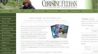
1. Make sure the colors go well together and it’s pleasing to the eye. Also, be sure the text can be easily read against the back ground.
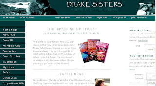
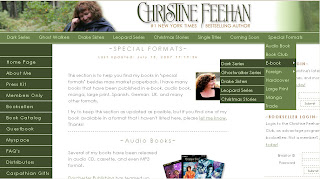
See how the black text looks against the white background? It’s easy to read and I don’t have to strain my eyes to read anything. The link color matches the overall theme, but also stands out against the white, which is important. I don’t have to wonder if there’s a link, I know just by the different colored text. Also, the sidebar is a dark color, but blends well with the header and toolbar. It’s really simple, overall, but it works extremely well.
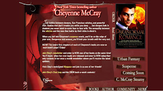
What doesn’t work? Having a dark/busy background with lighter text. It makes it hard to read. Cheyenne McCray’s website (http://cheyennemccray.com/) is a good example. Overall it’s functional, but the busy background makes the text hard to read.
You don’t have to have a busy website. Simple and elegant is often more attractive, IMO.
2. Have a separate page for each of your books and as well as separate pages for each series, outlining each book and the reading order.
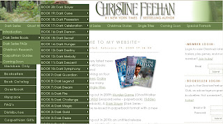
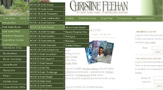
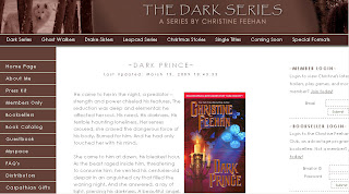
Each of Feehan’s series is listed at the top of the page. If you hover your mouse over each link, a drop down box appears listing separate pages for the series, including a full list of each of the books and the reading order of them. If you move your mouse over one of the books, another drop-down box appears, with information about that specific book.
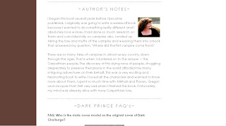
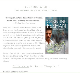
Each book has it’s own separate page that includes all available information about that book, including the blurb, publication information, where to buy and excerpts – if available.
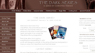
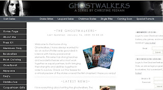
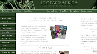
Not only can you hover/click on Feehan’s site, but you can also click the series link and it will take you to a separate page for that series.
As you can see, not only is all the series information available in once place, but each page has it’s own color and theme. This isn’t a necessity, but it sure does make it easy to navigate. Not to mention it’s pleasing on the eye.
This is extremely helpful to readers, especially if – like Feehan – you have an extensive backlist or long running series. I want to be able to load your site quickly, click a link and have all the information I need right there. I don’t want to have to scroll through endless pages to find a book.
At the bottom of each page, including the homepage, is a footer that includes the links to each series page.
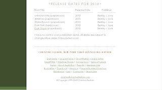
This isn’t a necessity, either, but I do find it to be helpful. Also at the bottom of the homepage is Feehan’s upcoming publication schedule.
Having a list right there is extremely helpful. Of course, there’s also a tab on the toolbar for upcoming releases, but this consolidates everything, which I like.
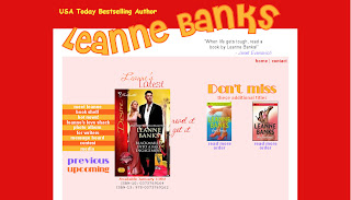
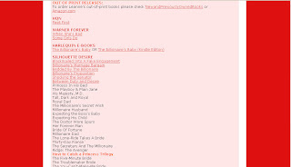
An example of a site that doesn’t work? Leanne Banks’(http://www.leannebanks.com/). Although the design is simple, the red is a bit overpowering. Even worse, however, is the book list page. There are a few images at the top of the page, but otherwise it’s just a list of her books, some with links to Amazon, others without. No information about the books, where to buy, blurbs, connection to other books, etc.
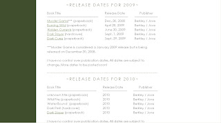
3. Update your website. Update, update, update. Update daily if you have to, but update. Check out Feehan’s release schedule:
See how 2009 and 2010 are listed. There’s a notice there that says things are subject to change as she has no control over her publication schedule and that’s fine. But what’s great is that we’re in 2009 and the list is current for 2009 AND 2010. She isn’t still listing her 2007 release schedule with a note that says, “Updates coming soon”. Nothing is more annoying to a reader than wanting information about an upcoming book and not being able to find it on an author website. Seriously.
One of the worst offenders, IMO, is Nora Roberts as J.D. Robb (http://www.noraroberts.com/jdrobb/). Not only is the site rarely updated (the excel list of novels is about 10 books behind) but it’s outdated as well. There is a full list of books in the order they were published, but there aren’t separate book pages with excerpt and book information.
4. Do not include streaming music or videos that play automatically. I realize as an author you’re proud of your book trailers and want everyone to see them, but do you have any idea how many times I was almost fired because I snuck onto an author website at work and had a book trailer video blare? Or a song blast out? It’s extremely annoying.
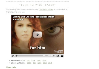
Feehan has teasers and trailers up for many of her books, but you have to click to play them. This is the way it should be. I do not want to be force fed your trailers. I also do not want music coming from your site. Not if it plays automatically. You want to include the playlist you created for each book as you were writing it, great! I’d love to see it. See being the operative word there. I don’t want to hear it first thing when your site loads.
Julie Garwood (www.juliegarwood.com) is one that it includes autoplay audio. There are nature sounds playing in the background. Which is fine to include as long as they aren’t autoplayed or they can be turned off – which unfortunately isn’t the case on Garwood’s site.
Sadly that isn’t the only problem with Garwood’s site, but I’ll get into that later.
5. Include the back blurb for your book on your website. I mentioned this above, but it’s worth repeating. I can’t begin to tell you how frustrating it is as a book reviewer to not be able to find the back blurb online. Bookstores often list only a quick blurb, and not the one from the back, or sometimes none at all. Please include the full back blurb on your site.
6. Alternate format links are always appreciated. As many of you already know, I’m a huge fan and supporter of eBooks. If possible, I’ll buy in e-format before print (most of the time). That said, I’d like to see authors include “buy” links for alt formats.
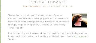
Feehan has a tab for special formats on the toolbar as well as a separate page listing them.
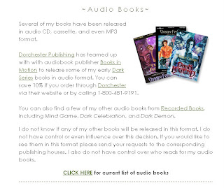
She lists each available format and includes links to each book available in that special format. The two most important (or should I say popular?) are e-Book and Audio Book. I like that she offers a link to all the books available in these formats.
Feehan takes it a step further and also offers links to many other alternate formats, including Hardcover, Foreign Print, Trade, Manga and Book Club Hardcover. I don’t know that listing that many formats is necessary, but it sure is convenient.
7. Excerpts. This is something readers seem to split on. Personally, I don’t think an excerpt is necessary, but I do think it’s nice to have. A blurb is absolutely 100% necessary because it tells what the book is about. And excerpt is a bonus as it only teases the reader but (shouldn’t) doesn’t give any info about the overall story.
Other readers think an excerpt is more important than a blurb, or at least as important. I know for a new-to-me author an excerpt can be the deciding factor on whether or not I buy their book.
Although, this is an article about author websites, but I would like to mention here that excerpts should be at least several paragraphs, possibly even a full page (depending on the size of the work being quoted) and should contain no plot/series spoilers. This was a point that was brought up when I asked for input about websites on Twitter.
8. Properly labeled alt tags and links that actually work. I can’t tell you how frustrating it is when you click a broken link and get an error message and/or blank page. Alt tags were mentioned by ShannonC of Flight Into Fantasy and TGTBGU. For those of you not in the know, Shannon is blind. Authors, you need to think about ALL your readers when designing your website. As Shannon said on Twitter:
Alt tags should be labeled correctly because if I don’t know what your pictures lead to, I will not stay to click.
9. Flash-free or no-java options are always a plus. Some websites make use of flash, which are fine, except if I want to link to a specific page on your site or if my browser doesn’t support flash – in which case your website is useless to me. Two excellent examples of this are Julie Garwood’s website (http://juliegarwood.com/) and as Jane of Dear Author pointed out, Libba Bray’s website (http://libbabray.com/).
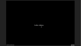
When I type juliegarwood.com into my browser this is the first thing that shows up:
It takes anywhere from 30-60 seconds to load. Before I got a new computer it took upwards of 5 minutes to load. For those of us with slow running/old computers, these flash sites aren’t worth the trouble.
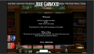
Now I get a welcome message from her telling me play on her site.
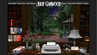
And finally the page loads. It’s interesting to play around with – you can open the window and desk drawers, find hidden treasures around the desk, etc. But that isn’t very functional if I’m just looking for information and don’t want to play.
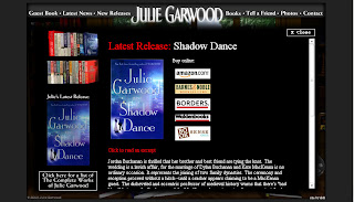
She has added links at the top to make things easier to navigate (something she didn’t have when the site first went live) but it’s flash based which means I can’t link to separate pages.
Bray’s site is even more gorgeous, and even less functional. Her homepage is nothing more than a collage of images that don’t make sense in conjunction with the text they represent (a pair of shoes for resources?).
Now that I’ve landed here, I have no clue where to go or what to do. If I run my mouse over the site it doesn’t change if I’m hovering over a link, so I don’t know where to click for additional information.
As Jane pointed out, these sites are visually stunning, but almost completely useless. As noted above, Feehan’s site is pleasing to look at but also completely functional. Her website is not the most beautiful I’ve ever seen, but it is a good example of what works and what doesn’t.
Authors, the point of your website should be functionality. I need to be able to find the information I seek on on your site. It doesn’t matter how beautifully done it is if it doesn’t load or if I can’t figure out what your books are.
I think I’ve probably gone on enough here, but let me just add a few more common sense items that other readers mentioned when I asked for input, in no particular order:
1. Typos. You make a living off the written word – how about making sure it’s spelled right?
2. Too many clicks to get where I need to go. Keep it simple.
3. Submit Forms. I prefer a simple “input email address” section than a full form that needs to be submitted. If, however, you have to do a form, please make sure there’s no error code after hitting “submit”. Very annoying.
4. NSFW (Not Safe For Work) content. PLEASE authors, PLEASE, clearly mark your questionable content as NSFW. This is imperative! (thanks to Kat at Book Thingo for this)
Readers, have any other suggestions for authors about their website content/design? Anything else that drives you absolutely crazy?

