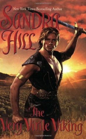
It’s Saturday so you know what means. Another weekly dose of really bad romance novels. Check out this week’s cover.

Here’s another Avon cover that just isn’t good. It’s dark, the hero’s face doesn’t seem to fit the rest of his body and it’s just so, so bad. Why are Avon covers so bad???


He looks like he stole his outfit from a cocktail waitress who works the AM shift at a mid-level Gulf Coast casino.
Ok, first, who picked that font??? It looks like the author’s name is Sandra Hiss, and the title is The Very Little Viking. Somehow I don’t think that’s the impression they wanted to give. Second, he looks oh so cute in that little cocktail waitress dress!
For as short as the tunic is, we can’t really tell how virile he may be.