This is a topic that has been on my mind for some time. As a reader and reviewer, I think having a great, attractive, easy-to-navigate website is and should be a priority for authors. With that in mind, I’m going to offer some tips from a reader perspective.
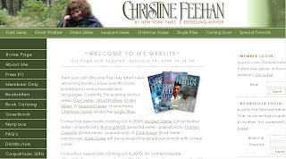
I’m going to use Christine Feehan’s website as a reference guide, because I think it’s very well put together.
1. Make sure the colors go well together and it’s pleasing to the eye. Also, be sure the text can be easily read against the back ground.
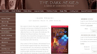
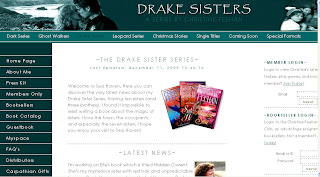
See how the black text looks against the white background? It’s easy to read and I don’t have to strain my eyes to read anything. The link color matches the overall theme, but also stands out against the white, which is important. I don’t have to wonder if there’s a link, I know just by the different colored text. Also, the sidebar is a dark color, but blends well with the header and toolbar. It’s really simple, overall, but it works extremely well.
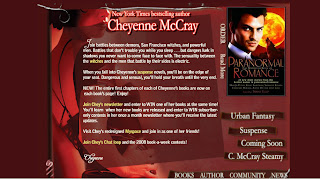
What doesn’t work? Having a dark/busy background with lighter text. It makes it hard to read. Cheyenne McCray’s website (http://cheyennemccray.com/) is a good example. Overall it’s functional, but the busy background makes the text hard to read.
You don’t have to have a busy website. Simple and elegant is often more attractive, IMO.
2. Have a separate page for each of your books and as well as separate pages for each series,
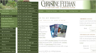
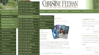
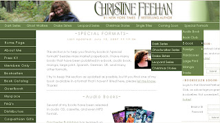
Each of Feehan’s series is listed at the top of the page. If you hover your mouse over each link, a drop down box appears listing separate pages for the series, including a full list of each of the books and the reading order of them. If you move your mouse over one of the books, another drop-down box appears, with information about that specific book.
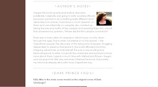
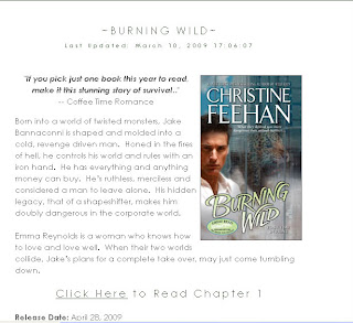
Each book has it’s own separate page that includes all available information about that book, including the blurb, publication information, where to buy and excerpts – if available.
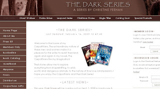
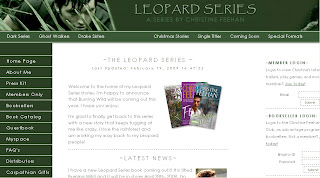
Not only can you hover/click on Feehan’s site, but you can also click the series link and it will take you to a separate page for that series.
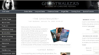
As you can see, not only is all the series information available in once place, but each page has it’s own color and theme. This isn’t a necessity, but it sure does make it easy to navigate. Not to mention it’s pleasing on the eye.
This is extremely helpful to readers, especially if – like Feehan – you have an extensive backlist or long running series. I want to be able to load your site quickly, click a link and have all the information I need right there. I don’t want to have to scroll through endless pages to find a book.
At the bottom of each page, including the homepage, is a footer that includes the links to each series page.
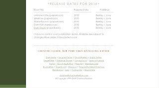
This isn’t a necessity, either, but I do find it to be helpful. Also at the bottom of the homepage is Feehan’s upcoming publication schedule.
Having a list right there is extremely helpful. Of course, there’s also a tab on the toolbar for upcoming releases, but this consolidates everything, which I like.
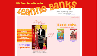
An example of a site that doesn’t work? Leanne Banks’(http://www.leannebanks.com/). Although the design is simple, the red is a bit overpowering. Even worse, however, is the book list page. There are a few images at the top of the page, but otherwise it’s just a list of her books, some with links to Amazon, others without. No information about the books, where to buy, blurbs, connection to other books, etc.
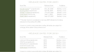
3. Update your website. Update, update, update. Update daily if you have to, but update. Check out Feehan’s release schedule:
See how 2009 and 2010 are listed. There’s a notice there that says things are subject to change as she has no control over her publication schedule and that’s fine. But what’s great is that we’re in 2009 and the list is current for 2009 AND 2010. She isn’t still listing her 2007 release schedule with a note that says, “Updates coming soon”. Nothing is more annoying to a reader than wanting information about an upcoming book and not being able to find it on an author website. Seriously.
One of the worst offenders, IMO, is Nora Roberts as J.D. Robb (http://www.noraroberts.com/jdrobb/). Not only is the site rarely updated (the excel list of novels is about 10 books behind) but it’s outdated as well. There is a full list of books in the order they were published, but there aren’t separate book pages with excerpt and book information.
4. Do not include streaming music or videos that play automatically. I realize as an author you’re proud of your book trailers and want everyone to see them, but do you have any idea how many times I was almost fired because I snuck onto an author website at work and had a book trailer video blare? Or a song blast out? It’s extremely annoying.
Feehan has teasers and trailers up for many of her books, but you have to click to play them. This is the way it should be. I do not want to be force fed your trailers. I also do not want music coming from your site. Not if it plays automatically. You want to include the playlist you created for each book as you were writing it, great! I’d love to see it. See being the operative word there. I don’t want to hear it first thing when your site loads.
Julie Garwood (www.juliegarwood.com) is one that it includes autoplay audio. There are nature sounds playing in the background. Which is fine to include as long as they aren’t autoplayed or they can be turned off – which unfortunately isn’t the case on Garwood’s site.
Sadly that isn’t the only problem with Garwood’s site, but I’ll get into that later.
5. Include the back blurb for your book on your website. I mentioned this above, but it’s worth repeating. I can’t begin to tell you how frustrating it is as a book reviewer to not be able to find the back blurb online. Bookstores often list only a quick blurb, and not the one from the back, or sometimes none at all. Please include the full back blurb on your site.
6. Alternate format links are always appreciated. As many of you already know, I’m a huge fan and supporter of eBooks. If possible, I’ll buy in e-format before print (most of the time). That said, I’d like to see authors include “buy” links for alt formats.
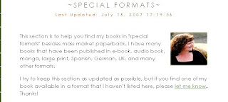
Feehan has a tab for special formats on the toolbar as well as a separate page listing them.
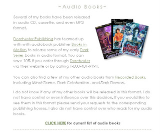
She lists each available format and includes links to each book available in that special format. The two most important (or should I say popular?) are e-Book and Audio Book. I like that she offers a link to all the books available in these formats.
Feehan takes it a step further and also offers links to many other alternate formats, including Hardcover, Foreign Print, Trade, Manga and Book Club Hardcover. I don’t know that listing that many formats is necessary, but it sure is convenient.
7. Excerpts. This is something readers seem to split on. Personally, I don’t think an excerpt is necessary, but I do think it’s nice to have. A blurb is absolutely 100% necessary because it tells what the book is about. And excerpt is a bonus as it only teases the reader but (shouldn’t) doesn’t give any info about the overall story.
Other readers think an excerpt is more important than a blurb, or at least as important. I know for a new-to-me author an excerpt can be the deciding factor on whether or not I buy their book.
Although, this is an article about author websites, but I would like to mention here that excerpts should be at least several paragraphs, possibly even a full page (depending on the size of the work being quoted) and should contain no plot/series spoilers. This was a point that was brought up when I asked for input about websites on Twitter.
8. Properly labeled alt tags and links that actually work. I can’t tell you how frustrating it is when you click a broken link and get an error message and/or blank page. Alt tags were mentioned by ShannonC of Flight Into Fantasy and TGTBGU. For those of you not in the know, Shannon is blind. Authors, you need to think about ALL your readers when designing your website. As Shannon said on Twitter:
Alt tags should be labeled correctly because if I don’t know what your pictures lead to, I will not stay to click.
9. Flash-free or no-java options are always a plus. Some websites make use of flash, which are fine, except if I want to link to a specific page on your site or if my browser doesn’t support flash – in which case your website is useless to me. Two excellent examples of this are Julie Garwood’s website (http://juliegarwood.com/) and as Jane of Dear Author pointed out, Libba Bray’s website (http://libbabray.com/).
When I type juliegarwood.com into my browser this is the first thing that shows up:
It takes anywhere from 30-60 seconds to load. Before I got a new computer it took upwards of 5 minutes to load. For those of us with slow running/old computers, these flash sites aren’t worth the trouble.
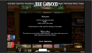
Now I get a welcome message from her telling me play on her site.
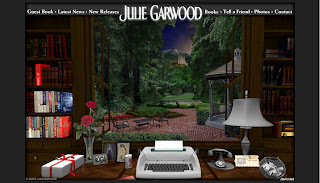
And finally the page loads. It’s interesting to play around with – you can open the window and desk drawers, find hidden treasures around the desk, etc. But that isn’t very functional if I’m just looking for information and don’t want to play.
She has added links at the top to make things easier to navigate (something she didn’t have when the site first went live) but it’s flash based which means I can’t link to separate pages.
Bray’s site is even more gorgeous, and even less functional. Her homepage is nothing more than a collage of images that don’t make sense in conjunction with the text they represent (a pair of shoes for resources?).
Now that I’ve landed here, I have no clue where to go or what to do. If I run my mouse over the site it doesn’t change if I’m hovering over a link, so I don’t know where to click for additional information.
As Jane pointed out, these sites are visually stunning, but almost completely useless. As noted above, Feehan’s site is pleasing to look at but also completely functional. Her website is not the most beautiful I’ve ever seen, but it is a good example of what works and what doesn’t.
Authors, the point of your website should be functionality. I need to be able to find the information I seek on on your site. It doesn’t matter how beautifully done it is if it doesn’t load or if I can’t figure out what your books are.
I think I’ve probably gone on enough here, but let me just add a few more common sense items that other readers mentioned when I asked for input, in no particular order:
1. Typos. You make a living off the written word – how about making sure it’s spelled right?
2. Too many clicks to get where I need to go. Keep it simple.
3. Submit Forms. I prefer a simple “input email address” section than a full form that needs to be submitted. If, however, you have to do a form, please make sure there’s no error code after hitting “submit”. Very annoying.
4. NSFW (Not Safe For Work) content. PLEASE authors, PLEASE, clearly mark your questionable content as NSFW. This is imperative! (thanks to Kat at Book Thingo for this)
Readers, have any other suggestions for authors about their website content/design? Anything else that drives you absolutely crazy?








Very nice post! Great advice, and I’ll be using some of your tips on my next update. 😉
Wendy,
That is definitely my number one pet peeve. I can get around many other issues, but not having a full list of books and their reading order is an EPIC FAIL.
Seneca,
Good to know. Off to check them out.
Sonja,
Thanks!
Very good points. Now I have to go check my site and see if it passes…
Uh-oh.
Wow, what a great thorough post. I like Jim Butcher’s site too.
Yes! Although I would argue that these guidelines should apply to most everyone’s websites. I’m sure I break at least a few rules myself.
Good points! There are some things I use to make my browsing experience a bit better. As a Firefox user, I use FlashBlock and Stop Autoplay so that I can choose whether to listen to music or watch videos. For those sites with unfortunate text/color combinations, or simply with bad layouts, I recommend Readability.
Great post Holly! I don’t like complicated websites and I like the ones that are clean and simple and updated frequently 🙂
When designing their websites or asking someone to do it, authors should test it afterwards… Like ask themselves potential questions that readers might have and try to locate the answers and see if it’s easy or not.
This is awesome, and so true. Easy and quick to navigate are very important things to keep in mind. And definitely update the site.
I think if an author is going to have a website, they should invest the money and time to get it right. I know this can be an expense (something they can use as a tax write-off?) but it gives a better impression than the glittery, bubblegum images that makes it look like an 8-year old girl designed it. I also don’t like to scroll down for pages and pages.
Great topic! I’m copying this for future reference when I might need a site!
One of my personl favorites is J.K. Rowling’s. Really clever, and exactly what you’d expect in terms of the books.
You’ve touched on two of my pet peeves:
1) Being assaulted by audio as soon as you arrive. I don’t get fired, but I do pay the price in crying baby (since I surf when she naps).
2) Not giving enough prep for possible adult images or content. I was on a new-to-me author site recently and clicked on a button with another name (I assumed it was a pen name for another genre) and came to an image of a nude woman in handcuffs, behind her back, ankles also chained and attached to wrist restraints. Every reader comes with mental baggage; because of mine I take care to avoid sites with this type of imagery (just writing about it now is making my heart slam). Needless to say I won’t be back to visit that site nor am I inclined to try out the author’s other works.
3. Getting to an author’s site, only to be directed to ‘click to enter’. To me, that only makes sense if it is to verify the person is over 18. Otherwise – why am I being made to take an extra step and endure more loading time?
KISS- Keep it simple stupid is my motto. The same goes for websites, the easier it is to navigate, the more I will come back and perhaps buy your product.
When designing my web site, my rule of thumb was no more than two clicks to get to any given piece of information the reader might be looking for. One’s better. Readers in general want to know three things: what books I have available now, where to get them, and what’s next (and new).
One of my pet peeves is an author listing a series but there’s no indication of reading order. Maybe to the author it’s obvious, but unless there’s a specific “book 1, book 2, book 3” etc. right on the cover or blurb, it’s not clear. I don’t care if each book is supposedly a stand-alone – it’s better to read them in order. 🙂
Great web site observations. I’ll add a couple minor quibble with design. One is that different audiences may like different designs. Dark background with light writing may work very well for a horror author, for instance.
The second quibble is that I think it is misleading to say “The point of your web site should be functionality.” I could say the same thing about a car – a la Henry Ford – and I wouldn’t sell very many. Some authors may choose to use their web site more for a visual experience than others – it doesn’t make them wrong. You do mention that the web site needs to be both visually pleasing AND functional and I’d agree. I just think the balance will be different for different people. And it’s always a balancing act – there’s no such thing as a free lunch where you can have perfect functionality and perfectly eye-grabbing design.
Wow, nice post!
My biggest issue, which I’ve come across a lot of lately, is no linking a book to where I can buy it.
If I see your book and it looks interesting, chances are I’m probably going to buy it if I can click on the book and be taken straight to Amazon or wherever it’s sold. But if I click on the book pic and I get nothing, that makes me have to go an extra step/s of having to search where to buy it. You probably just lost a sale there because unless I’m really jonsen for that book, I won’t bother.
Other thing I really want, back list in publication date order and series clearly marked.
@Edward G. Talbot
I understand where you’re coming from, but the point of a website IS functionality. I believe there can absolutely be a middle point there, where a website is both pleasing to the eye and functional, but as a reader the reason I visit an author website is not to see how pretty it is, but to find information about his/her books.
If I open the site and can’t navigate my way around it, or can’t find a list of books, or can’t figure out what order a series should be read in, I’m going to leave feeling unsatisfied – and often annoyed – no matter how beautiful the design.
@MB Leah,
I hadn’t considered that, but you are absolutely correct. Authors should have “where to buy” links if possible.
Very nice! And completely correct.
I just ran across a page on an author site that had a royal blue sidebar with red text. It gave me a headache. >.< Aesthetics are important, plzkthx.
Wonderful post Holly! Very thorough. I agree with you about Feehan’s site – very easy to use considering the huge amount of info on there.
Your mention of the dark background/light text reminded me of Erin McCarthy’s site and how she has the option of changing the color scheme which also changes the text/background from dark on light or light on dark. Very cool
This is an excellent post. Authors/writers often put a great deal of time and effort into a wonderful book but then turn around and put little into marketing. Then they wonder why visitors don’t stick around to buy.
I agree with what’s been said already. No matter if you’re selling rice, rhinos or romances, today’s buyer will only work so hard to get what they need, people in the media/reviewers even less.
Not sure if your website measures up? Ask! You get editor, audience, reader feedback for your book, do the same for your site. Involve the right people and you’ll pass with flying colors.
I totallly agree about Music that plays as soon as you enter a site, that alone will have me leaving.
And series, I want to know reading order especially for new to me authors.
Bianca D’Arc and Robyn Carr come to mind, there sites require very few clicks and are clear on what order to read their series in.
Light backgrounds with dark text are not necessarily better.
I have a much easier time with light on dark than the opposite. Many people with fair eyes or light sensitivity share the preference.
All I want is something current, clean, and easy to navigate. Style is a matter of opinion.
Very well done post!! You hit on all the things I like/don’t like about author websites.
I know it can be quite expensive, but it’s a product you are trying to sell and your website is one of the best advertisements for the product.
When I saw your headline subject my first thought was how much I dislike Julie Garwood’s site. And then there it was on your list! There are a lot of great author sites out there, and the key is to keep it simple, current, and relevant.
Great post Holly! For me, it’s all about your third point:
Update your website. Update, update, update. Update daily if you have to, but update.
I just finished reading the sixth book in Julia Spencer-Fleming’s series and I was like…’Please…I need to know there will be a seventh book’. But the author hadn’t updated to I emailed…and she replied the next day saying she was working on the seventh book…and her website has since been updated 🙂
As one of the gals behind Robyn Carr’s website, just wanted to say thanks!
We worked very hard to make it easier for readers to know which books came when — and how the various series progressed.
We’re in the middle of doing a new website for Sabrina Jeffries — that will build on (as one commenter mentioned) Sabrina’s insistence on giving both helpful (and fun) information on her books.
That website should be up by the first of April.
Meanwhile, you might want to check out Deanna Raybourn’s new website for a mix of both logical info (series in order, etc.) and an arty twist befitting her personality, we think!
Jeanne Devlin
NBPR
Great post 😀
Peeves – in no particular order
Automatic music – arghhhh.
A site so outdated it has virtual cobwebs – I would rather have NO site than one that is redundant.
Incomplete information about books – number in series etc, no blurbs and no excerpts.
What a great post! As a reader, I totally agree with pretty much everything said especially sites that take forever to load, the extra step to press enter, those not updated and ones like Julie Garwood’s. As an author, I’m heading over to evaluate mine against some of the other points you mention. Every author should read this!
Music and video that automatically launch. Also, authors who write series books yet don’t clearly label the order of their series. I want a list people. Nothing fancy. 1. Book One 2. Book Two 3. Book Three etc. Pretty covers, blurbs and excerpts are all nice – but I’m always amazed by how many author don’t provide a simple list of the order of their series books.
Wow. Great post. I have been trying to make one like it for months but I never finished it.
Sabrina Jeffries has the best website I have ever come across. Eloisa James is a very close second.
I never ever get bored at their sites.
This was a great post–I think you covered all my likes and pet peeves about websites! Great job!
Holly, I liek them because they have tons of inser info that seems little to them, but it’s intersting to me.
Sabrina Jeffires has cover sections for all her books. She lists the models, her onion of the cover, how much input she had, if the cover goes with any one scene in the book, etc.
Eloisa James has plenty of book info, with a page or more per book, but the best part are the mea cupla sections. How many other authors point out mistake in their books?
I love it.
Fantastic post and spot on. I am constantly amazed at the author sites I visit that don’t have purchase links, blurbs or book covers.
It’s good to know that there’s a practical reason for the alt tags. I’ve been getting lazy about them and will clean them up now that I know people actually use/need them.
This was an excellent post. Half of the team of Marilu Mann has a background in very modest webdesign. And the site, in that half’s opinion, needs MAJOR work still! LOL
Excellent points in more ways than one.
Absolutely terrific post. I think most readers would agree with you on every single point.
Hopefully some authors are taking notes.
As a foreigner (Finnish), the lack of “where to buy” doesn’t bother me. I have to order the books from local stores. It only comes handy if authors have only excerpts in their website, not back blurbs. Then I have to start digging the back blurb from other sites (usually clicking the “where to buy”)…
Jenn said: “Bianca D’Arc and Robyn Carr come to mind, there sites require very few clicks and are clear on what order to read their series in.”
You don’t know how scared I was when I saw my name pop up in relation to this discussion, but I’m relieved to see it was in a positive way. I spend a lot of time on my site. I write every line of code and, as some of you may know, I’ve made a lot of mistakes along the way.
As a small press author, I simply can’t afford to pay someone hudreds of dollars (possibly thousands, over time) to make and maintain a site for me. The sad truth is, Garwood probably paid someone a lot of money to make a fancy site that nobody seems to like. And paying someone to do the updates is insane when, like me, you have numerous updates every week or two.
So I chose to do it myself, on the cheap, as it were. I know I haven’t always gotten everything right, but I see my site as a WIP and probably spend way too much time tinkering with it. One thing I learned early on was to remove my actual email address from it. I know readers want a contact edress, but when I had my edress on the site I got bombarded with spam so badly, I had to change edresses. I’m pretty easy to find, so it hasn’t been a huge issue, I don’t think.
Comments and suggestions for my site are always welcome. As someone said earlier in this discussion, it’s important to have people look at your site and give you feedback.
I’m going to take a look at my site again, with the things you’ve brought up in this discussion in mind. Excellent blog! Thanks for being so thorough and informative!
Holly wrote: Authors should have “where to buy” links if possible.
That’s a sticky one when an author’s books are available from multiple outlets, esp. if it’s in both ebook and print. What if the reader has a Borders gift certificate but the cover is linked to Amazon, for example? Or owns a Sony reader but the link is to Kindle?
To that end, I have a prominent link on my books page that brings up a “Complete Buy Links” page. Listed by title, it gives the reader multiple options to purchase my books from Amazon, BN, Borders, Powell’s, MBaM, BAMM, Fictionwise, etc. etc. etc.
Opinions? Thoughts? 🙂
Just noticed something very interesting (to me, anyway!) about K.A. Mitchell’s site – the sidebar menu follows you down the page as you scroll down. Oooo, ahhhh (having site envy). 🙂
I like a relevant web address. Jane Smith’s web address should have her name in it. A “cute” address like dontulovehighlanders.com is totally irrelevant and does absolutely nothing to connect the author’s name with her site in my mind. If you do use a “cute” address, at least redirect it to a site with your name on it.
And what about authors who don’t even have web sites, or the ones with nothing beyond their publisher’s author page? Johanna Lindsey and Jen Holling come to mind. I ADORE those two authors, but they don’t have web sites.
Contact Me. I tried to send author Jen Holling links to a couple of squeeing reviews, but she doesn’t have a valid email address. Doesn’t she want to interact with her readers?
Karen Marie Moning has one of the worst web sites ever. It’s full of wonderful information, but it’s barely navigable. I hate misdirected and broken links, and I really hate getting trapped in a page and then not being able to back out of it. I shouldn’t have to follow a trail of bread crumbs every time I want a bit of information.
Series info is a biggie. I want to see series books grouped and numbered. Links, covers, and blurbs are a must.
Thanks for sharing your perspective. Very helpful. I too find blaring music annoying and will be more likely to x-out than to adjust the volume.
Excellent post, Holly! I maintain a few sites and a blog, and we’re always struggling with clarity and organization on them.
On my personal book blog, I love to link to author’s sites, book pages, and excerpts (when they have them), but I find it frustrating when the author’s site is configured in a way that does not allow me to easily find the link urls.
For ex: Kristan Higgins (whom I love!) site is very cute, but no indiv book links and I have to work to get the single general books url. If I were a regular casual reader, I’d be stumped to find it (I have to right click the correct link and copy it to do anything with it.) Rachel Gibson’s site is the same. They’ve both gone for a cute look over accessibility.
Rob Thurman has a very cool flash thing going on on her site’s homepage, but, again, no indiv book url, and because the indiv book descriptions are in a flash animation, I had to transcribe it by hand when I wanted to feature her book.
Thanks for a post with much food for thought!
Very interesting post and discussion. I will add, however, that I happen to like the light text on a darker background… as long as the type isn’t too small or some glaring color like hot pink. 🙂
I’ve recently redone my own website — opting for something much smaller and streamlined. But I see there are a couple of things I probably need to go back and add.
Thanks for the insight!
Wow, this could have been a whole blog series. I’m redoing my site and will definitely bookmark this.
On an interesting note, I was recently told NOT to have separate pages for each individual book because it gets too unwieldy. Of course, I don’t have the volume of Christine Feehan, but I could see some logic to it. Good to get another viewpoint on this.
–Lisa
http://authorlisalogan.blogspot.com
@Meg Allison
I think the light text/dark background is totally subjective. I know a lot of readers complain that it’s hard to read. When we first opened this site we had black and red..big mistake!
@Lisa Logan
As for the separate pages, I think having one place on your site that lists all your books with the option to click to a separate page is the way to go. This is speaking as a book reviewer, however. I like being able to link to specific books/blurbs/excerpts on an authors site.
@Renee
Crusie and Gibson were two I had on my list for Java. I really hate those sites. It’s so frustrating not be able to link to or get the blurb from them, isn’t it?
@ JenB
Excellent point, I’d forgotten about that. What site was it that I recently tried to visit and couldn’t find..Oh, Joey W. Hill. Her site address is something cutesy like that. Very annoying. I had to Google her name to find it.
Ooh I agree. I remember visiting Cherry Adair’s site: http://www.tflac.com/. While very pretty, it was completely and utterly useless. I couldn’t find what I wanted and it took a long time to load. I have dsl, I really pitied those people on dialup.
Thanks for the info. It is interesting that your summary lists point #1 as a warning to watch for typos. In your explanation of having a separate page for each book, you wrote an “it’s” where you should have an “its” instead. Sorry to mention, but maybe another set of eyes would have caught that. 🙂 I skimmed the rest and didn’t check for other typos…
Dunno, Seneca, could this be the same anon who harped about typos in an old review? Someone with a dull axe to grind with the ladies here?
yeah, Joey Hill is storywitch.com or something like that.
Not that I like to give anons the time of day, but Holly is correct. it’s is a short form of it is. or it has.
Using its doesn’t make sense in her sentence. What does it belong to?
@anon
Cherry Adair’s website is awful! I waited over a minute and a half for her website to load, all the while listening to that awful music. That was terrible. 🙁
Excellent post. Thanks for the ideas for making my website more functional. I’d despaired of not having all the cool flashy-things, but now it seems I needn’t have worried.
One thing that surprised me is the insistence on having the back cover blurb. Since I don’t get to write my blurbs, (and a suprising number of authors don’t!) I haven’t included them, opting for a quick (under a minute) trailer (which has to be clicked to play) before my excerpt begins. Are you telling me readers would rather have a blurb than a trailer?
Since I recently re-vamped my website, I’d love to have some honest reader feedback. If you have some time to give to me, please visit http://www.emilybryan.com. First one to spot an error or broken link and report it, gets a signed copy of PLEASURING THE PIRATE!
Thanks!
I’ve always liked Christine Feehan’s website. Not only is it easy to navigate, but there is always up to date information.
I hate Julie Garwood’s site. It loads sooooo slow. And the music? Meh.
I agree w/ #4. Marking NSFW would definitely be helpful.
@EmilyBryan
Obviously I can’t speak for all readers (as Seneca has proven) but personally I’ll take a blurb over a trailer any day. Here are a couple things to consider:
1) I visit your webpage and there’s no blurb telling me what it’s about, only a trailer. Personally, I don’t like trailers, so I hardly ever watch them (no matter how well done they are). I haven’t been on your site for more than 5 seconds and already I’m unhappy because I can’t find the information I want. Which means I’m not going to buy your book. You just lost a sale because I don’t know what your book is about.
2) What if I’m at work or on my mobile phone and can’t watch the video? As with the scenario above, I can’t find the information I want about your book and therefore don’t buy it.
It takes me about 10-20 seconds to read a full blurb, 30 on the outside. Your trailer is what? 60 seconds (or close to it)? If I’m in the middle of placing an order at an online bookstore I’m not going to wait that long.
As with excerpts, I feel trailers are a bonus, not a necessity. Therefore if you have nothing but a trailer available on your site, I’m probably not going to stick around to buy.
Like I said, every reader is different but that’s how I feel about it.
I will say, other than that, I think you have a great site. I think it’s very pleasing to look at and seems completely functional.
My preferences align with Holly’s for the most part.
Excerpts are good, if I already read the blurb. The blurb–whether the official one or something written by the author to give readers an idea while marketing does its thing–tells me in general terms whether this book is something I might want to read or not.
The excerpt, for an unknown-to-me-author, gives me a sense of the writing voice (and it’s perfectly fine if that voice is different depending on the novel/series genre too, just gimme a taste.
Being allergic to spoilers, I am usually leery of excerpts because–unless it says so right there at the top–I have no way of knowing if I’m getting chapter one or chapter ten, and that just… ugh.
On trailers: I only watch them after I’ve read the blurb, and even then only for authors I know I like. See, as far as I’m concerned, books = reading, so the whole book = video thing? doesn’t quite follow for me.
Holly–Thanks for the imput. Going back to add blurbs to all my excerpt pages. Or maybe the blurb be on the Bookshelf page so the reader can decide there whether she wants to go further . . .
There are so many things to think about and how to make a website work for every reader is a good trick. And my DH wonders why I’m always tinkering with mine!
Emily,
Personally I’d like it if the blurb is listed next to the book on the bookshelf page. Also, another suggestion (I really hope you don’t mind!) – On your home page you have the cover/title for Vexing the Viscount. You should link the cover AND title so they take you the book page. The less I have to click, the happier I’m going to be.
Emily,
Personally, as long as the video tells me about the book, then I don’t require the blurb.
Some video trailers are pretty bad, but yours (I only looked at two) are good.
I plan to get Pleasuring the Pirate 🙂
Holly,
Thank you. I seriously appreciate suggestions on whatever will make my website more “user-friendly.” Off to make some new links on the home page!
If anyone else has a suggestion, I will certainly take a look at it!
http://www.emilybryan.com
I think Cherry Adair’s tflac site is innovative, but day-um, enough with the music! And having to click two different “enter” screens to get to the main site?
Another annoying thing is that if the user clicks to turn the music off, the sound pops right back on again when you go to another page. What part of “sounds off” does the site designer not understand?
One of my favorite author sites belongs to Eloisa James. She’s provided lots of things to explore. There’s a delicate balance between being entertaining and being succinct. If I was looking for quick info, I don’t know how effeciently organized her site is, but part of the goal of the author is to introduce readers not just to individual books, but to her whole fictional world. Eloisa’s site does a good job of that.
First, this is an invaluable post. I just e-mailed my site manager to ask him to disable the automatic music. It was written just for the site by an Emmy-winning composer, but you’re right. It’s an irritant. And I’ll make a few other changes, too,
All the points are well thought out and clearly presented. And the response about where to direct people to buy the book raises a thorny question. In addition to all the online sources, I would ABSOLUTELY include the IndieBound site, just to give independent booksellers their props. (And they’ve chosen both of my last books as picks.)
And as much as I hate to agree with an anon, there is an “it’s” problem, and it’s in this sentence: “Each book has it’s own separate page that includes all available information about that book . . .” That apostrophe just shouldn’t be there.
But this in nit-picking, considering the value of the post. Thanks for helping me straighten out my own site.
Great post– thanks.
Timothy, you are not agreeing with an anon–the anon pointed out a typo where there is not one. She/he said “List number one”
1. Typos. You make a living off the written word – how about making sure it’s spelled right?No typo there 🙂
As for the other, we all do it. I just think thought it was snotty of the anon to point out something that way. I’m not the only who saw her post as sarcastic with a fake smile. It just pushed a button.
You don’t need to remove the music. Just have a button somewhere that we can see clearly so that it can be turned off and on. That music on your site is catchy. I like it.
Thank you for the info. i’m having my clients read this first.
Jo Ann Hernandez
http://bronzeword.wordpress.com
GREAT post! You are so preaching to the choir. Sometimes I feel like I’m talking until I’m blue in the face to authors who do not understand the value of a well-designed, well-navigated Web site.
As a virtual book tour host at Pop Syndicate, it is incredibly frustrating to go to an author site hosted on a free service that has more commercials than information. I go to sites that have no media, no author photo, bio, book listings… I wonder if this person is every a “real” writer. Based on their Web sites, I don’t think they take it seriously enough, which makes me think their books won’t be great – and that they won’t be worth hosting. Period.
Authors should avoid flash sites, heavy graphics that clog even a high speed connection, and music and videos that automatically load. Those are incredibly annoying and slow up your net speed.
Great job! Thanks so much for posting!
Each time I contemplate adding flashy-things, I hear again that readers would like me to skip them. (Heavy sigh!) I was on Christie Craig’s site the other day and little tags kept sliding in. I was charmed, but I think I’m hearing readers really don’t what them.
This post continues to educate. Thanks for tackling the topic!
http://www.emilybryan.com
@Timothy Hallinan – You’re absolutely correct, there is an errant apostrophe in there and I apologize. Thanks for the heads up.
@Emily Bryan
I think flash has it’s place and I’m not saying you shouldn’t use it at all – after all, it is YOUR site and you should design it how you want. I just think it should be used in moderation. I also think your entire site shouldn’t be flash based.
@Everyone else…
Another great post about author websites can be found here.